We all get our work done differently. Some of us are at our desks from 9 to 5, while others work more flexible hours. Some of us commute to work, while others work from home (or do both). Regardless of our setup, we are always connected and available, either through our desktop or our phones.
However, neither of these devices seem particularly ideal for flexibility in the workday. Desktop environments require being tied to a large device all day with a constant barrage of information and expectations of multitasking. On the other hand, mobile devices have a limited form factor, which presents its own challenges to productivity. This is especially true in work from home scenarios where the boundaries between work and life often become blurred.
We believed the iPad could help bridge this gap. Previously, Slack on the iPad felt like a barebones version of the desktop app with some resemblance to our mobile clients. But we believed the iPad app could become good enough and robust enough to help us step away from our desks, change up our environment for a few hours, and still be productive. We wanted to build something special for our iPad users — something that felt familiar, powerful, lightweight, and accessible. Here’s how we did it. 
Why do people use Slack on the iPad?
What mattered the most to our iPad users? We did some research by conducting interviews with customers and discovered people mainly use Slack on the iPad for three main purposes:
- Triage & Catching Up: “I want to get through reading and responding to all my threads and conversations in Slack.”
- Searching: “I am looking to reference something from the past.”
- Being Mobile: “I am looking to stay connected throughout the day, and work from anywhere, at any time.”

Armed with this information, we wanted to build something special for our iPad users — something that felt familiar, accessible, and could help our iPad users meet these three goals more efficiently. Here’s how we did it.
So, what wasn’t working?
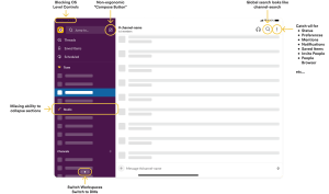
We audited the Slack iPad experience and noticed a few challenges. The iPad app didn’t feel as productive, responsive, or polished as our Desktop or mobile clients.
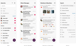
- Scattered Navigation: The iPad app had a fragmented navigation system that didn’t feel up-to-date with the latest OS patterns. Core tasks were taking up more time than they should have. “Mentions & Reactions” and “Settings” were hidden in the channel header. Search took over the whole screen, DMs weren’t discoverable, and so on.
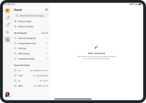
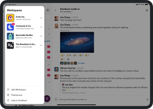
- Missing Features: Many of the features we launched on mobile and desktop apps never made it to the iPad, such as collapsible sections, avatars in the sidebar, accessibility upgrades, syncing section preferences, improved Search, updated workspace switcher, and more. It impacted people’s ability to triage and catch up, search effectively, and be productive on the go.
- Broken Accessibility (A11Y): Users with vision impairments using large A11Y text sizes were unable to read the names of the channels, DMs, or workspaces in the sidebar. VoiceOver users were unable to access their DMs and Workspace Menu with ease, or have the ability to determine their read channels from their unread ones.
- Outdated iPadOS Patterns: The iPadOS had evolved significantly since we first launched our iPad app. New UI patterns like sidebars, split-views, mouse pointer, multi-touch gestures, and hardware support common to native iPad apps were missing from Slack.
Sketching some ideas
We knew we didn’t want to make incremental changes to our iPad experience — it needed to be completely overhauled to produce meaningful change. We wanted to take a step back and map out what felt natural to iPad users, so we started with low-fidelity wireframes of how we wanted information to be organized.
We explored simple navigation patterns like the single pane view (a la a desktop-like world), as well as more advanced navigation patterns like a hybrid approach that combined tabs and sidebars. Below are some snippets from the many detailed prototypes we created in Figma:
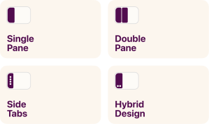
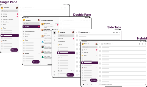
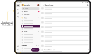
After bringing these Figma prototypes to our internal stakeholders and customers to get a pulse on initial reactions, we discovered people unanimously favored the Side Tabs. The structure felt the most intuitive to users — it offered deep levels of navigation and quick triage on a large-format mobile platform. It made multitasking across channels, DMs, Mentions, and Search easier.
Sculpting the Information Architecture (IA)
Two weeks after our early design explorations, we partnered with engineering. Building rough ideas in code with live data enabled us to discover constraints and iterate on the information architecture. We learned a few things here:
- We needed to build parity between platforms. Most of our iPad users also use Slack on their desktop and phones, and people who constantly switch between multiple devices expect a level of consistency between them. Certain surfaces needed more consistency than others, but we knew we needed to prioritize the channel list, displaying unread channels, the conversation view, and the overall navigation. We had to strike a balance between the familiarity of a tabbed hierarchy on iOS and the single-paned hierarchy that desktop offered.
- We needed to meet the expectations created by other iPad apps. Many iPad apps are known to be fluid and powerful. They have a standard left-to-right structure, with some depth in navigation for apps like Mail and Calendar. However, Slack’s growing capabilities meant more complexity. It needed multiple levels of navigation, from workspaces to channel sections, channels, conversations, threads, profiles, and beyond. Designing a system that felt like a native iPad app but worked at the level of complexity like Slack’s was a challenge in itself.
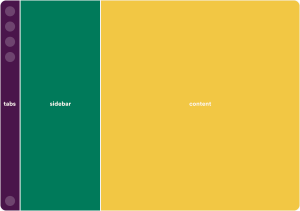
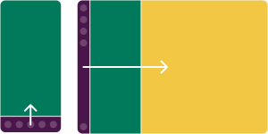
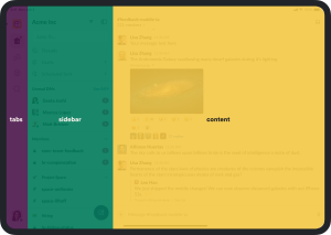
- We needed to recreate the navigation structure. While other apps constantly experiment with tabs, we knew we needed to define something that worked uniquely for Slack. We established a visual and mental hierarchy from left to right for the average user, so as they move through the app, tabs allow users to show their intent, the sidebar allows them to choose your task at hand, and the content view allows the opportunity to get the task done.
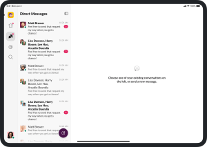
- We needed to help our users focus by eliminating distractions. As we built early prototypes, we found the tabbed navigation allowed users to be more focused on the task at hand. For example, when one is viewing their Direct Messages, they’re not distracted by incoming messages in the channel list. Breaking up the sidebar led to more intentional workflows.
- We needed to ensure the redesign was scalable. When it came to redesigning information architecture for entire app, we had to keep in mind three things: the design decisions made in the past, the mechanics of the app today, and our considerations for the future. We needed a structure that was robust and flexible enough to fit all these needs.
Getting into the weeds
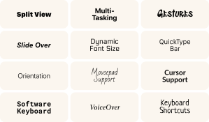
Once we had a basic understanding of how the architecture of the app was shaping up, we started getting into the nitty-gritty. The iPad provides a lot of flexibility in how users can work, which meant addressing small details for a frictionless experience. We needed to design for different layouts, orientations, keyboard, mouse pointers, and of course, the multi-touch functionality of the iPad. These details are what take a user’s experience from good to great, and require deep collaboration across product, design, and engineering.
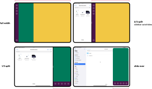
Accounting for Size Classes: iPad apps can be used in a full-screen mode, in split-view with other apps, or in slide-over modes where they have reduced real estate. Hence, the layout of the Slack app needed to be responsive. The visual design also needed to feel familiar with iPadOS patterns so users could have a seamless transition while switching between apps. iPads screens can range from 7.9” to 12.9” and can be used in portrait or landscape orientations. To account for all these variations, we structured our app in three modes — regular (full screen, landscape), semi-compact (portrait, split views), and compact (extremely narrow widths). Based on the state of the app, we adjusted the navigation for the most effective experience. For example, we auto-hide the sidebar in semi-compact modes to allow users to focus on the task at hand.
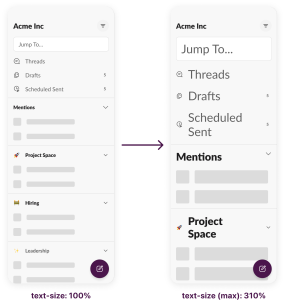
Building Accessible Experiences: Accessibility is a top priority while building products at Slack. With the redesign, we’re now able to share code with the iPhone app, making it more responsive to larger accessibility text sizes, and can also now scale the channel names, mentions, and direct messages based on the user’s chosen font settings. Our approach to a list-heavy sidebar format also enables large text to work with all the different layout permutations available. Another win on the accessibility front is improved VoiceOver labels. We added meaningful metadata about the channel, its unread status, and whether or not it is private. The ability to collapse sections and sort sidebar by recent activity also means that VoiceOver users can get to conversations faster.
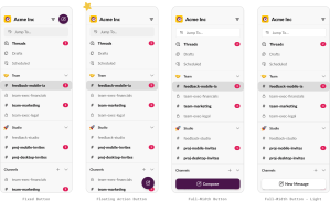
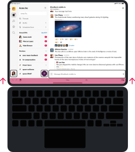
Accessories & Layout Changes: The iPad can turn from a simple reading device into a focused work device with just a hardware keyboard. Our app needed to support both this functionality as well. Now, when a hardware keyboard is attached, the location of the Compose button and the user profile photo shifts, so that the OS QuickType Bar doesn’t obstruct the interface. We also ensured that the input focus correctly shifts as the user switches between a mouse, touchscreen, and the keyboard, and also built functionality to retain the active conversation when the app switches from full-screen to slide-over or split-view. These small details have a big impact on the overall user experience.
The Outcome
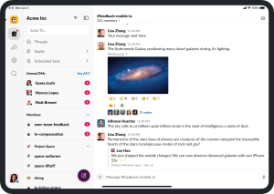
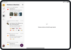
After dozens of design explorations, weekly tweaks on the prototypes, and addressing hundreds of pieces of feedback (internal & external), we bring to you the new iPad experience.
What’s Next?
These updates mark a giant leap in usability for our customers — but they’re just the beginning. Later this year we’ll be releasing even more upgrades, including improved support for keyboard shortcuts and accessibility. Have thoughts or feedback? Let us know on Twitter.
Special thanks to all our cross functional partners.
The post How we redesigned Slack for the iPad appeared first on Slack Design.